RAINER BRAND GUDIELINES
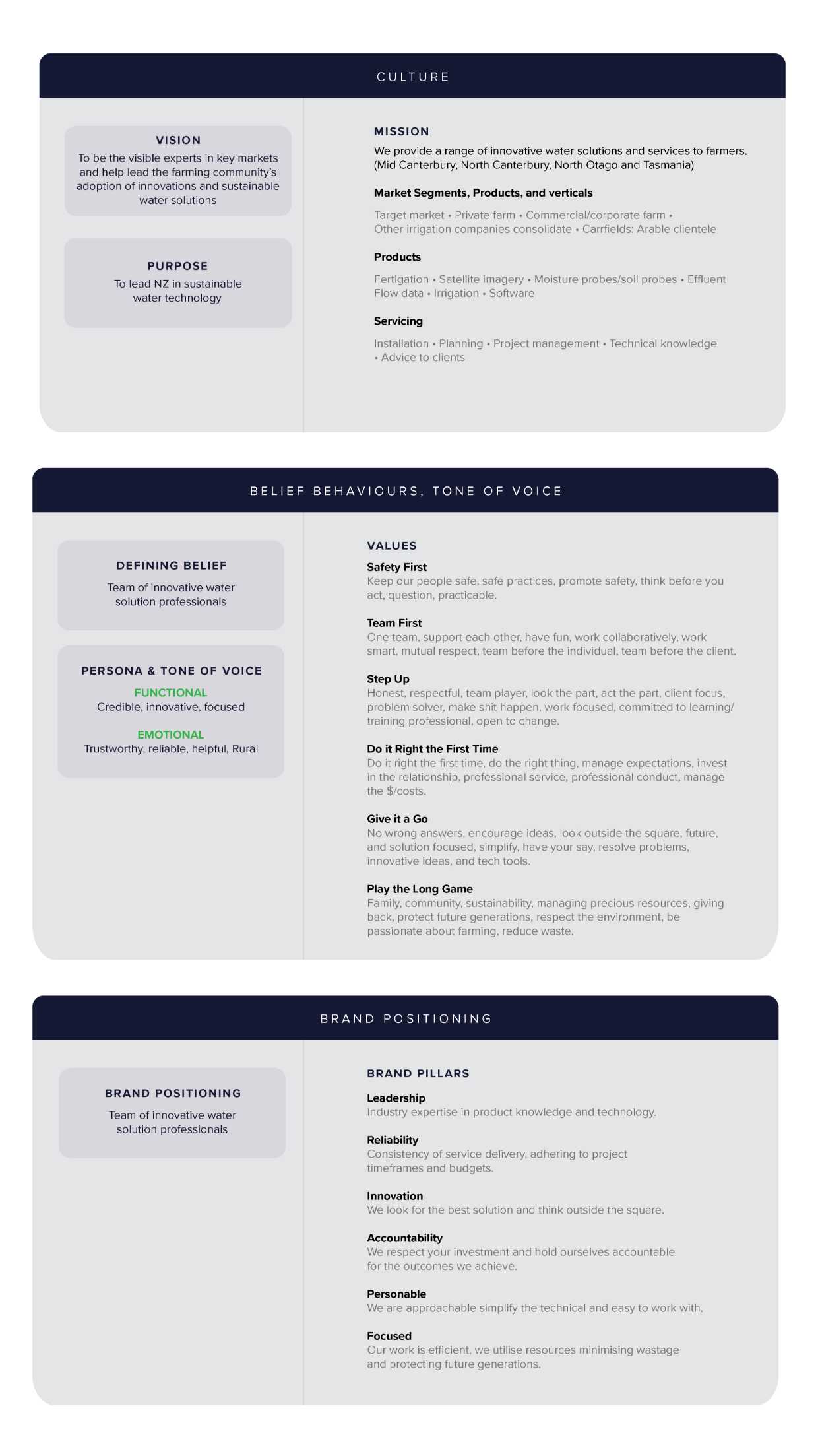
Brand Story
The landscape of New Zealand farming has changed incomparably since the 1990’s. The most influential industry development has been the national expansion of water schemes.
The availability of water to regions previously constrained by low annual rainfall has been dramatic – the iconic dryland Canterbury plains have transitioned to lush Dairy platforms, supporting multiple factories. Through precision fertigation products and monitoring technology, cropping farmers are increasing crop yields and viticulture growers are expanding into new territories. While traditional sheep and beef farmers are reaping the rewards of a reliable water supply – in a modern era of uncertainty, Rainer offers intelligent solutions.
Rainer has been partnering with farmers as pioneers in water supply through to the sophisticated resource management required today. Rainer respects the environment, ensuring through its operations that New Zealand’s precious resources are protected for future generations.
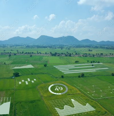
Intelligent solutions are a necessity to maximise water allocations, and Rainer is a true end-to-end supplier. Our product offering covers; precision fertigation nutrient applications for optimal pasture and crop production, allowing clients to customise the nutrient and water applications to individual paddocks in a crop rotation. Programmed satellite imagery and soil moisture probes provide real-time soil moisture data (via smartphone), informing irrigation applications with variable rates for the best efficiency of water applied.
We specialise in effluent system design, utilising the cycling of nutrients and moisture within the farm gate. Our latest flow meters and software accurately track the rate of water takes electronically, informing compliance regulators. Smart technology provides a quick response to changes in minimum flow data. At our core, we offer an extensive range of irrigation equipment, allowing us to design the most efficient water systems for our clients.
Evolving with the industry, we understand the complexity of environmental standards facing our clients. We strive to support our farmer’s planning for the future resilience of their property with the design of their systems, and the provision of tools to demonstrate their compliance with consent requirements. As pressure on resources continues to grow, this is an area that we see as only increasing in importance for farmers. Let us successfully guide you through the regulatory layers.
At Rainer, we are one team of experts in our field, and we deliver innovative solutions for our clients. As professionals, we excel at planning job timelines and budgets – we aim to do it right the first time. Across all our products, we have knowledgeable technical and field staff that undertake ongoing servicing. Our aspiration is that our work provides the communities we serve with certainty and growth.

Tone of Voice
Practical

We are real, grounded and listen to our client’s needs.
Trustworthy
We are careful with your investment, planning and budget management.
Innovative
Our experience, product and industry expertise inspire us to think outside the square.
Focused
We work together, team before individual – “to make shit happen”
Play the long game
We are committed to the sustainability of community growth and the environment.
Brand on a page
Rainer logo
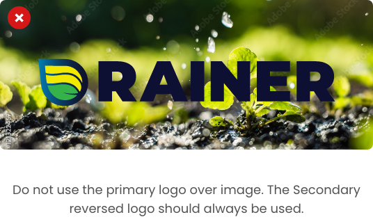
The primary visual element of the brand is the Rainer Logo.
It is this element that represents us and should be used in all communications.
Rainer logo variations
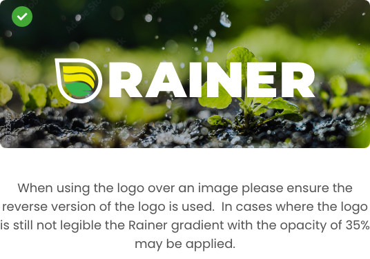
This is the reverse variation of Rainer’s primary logo. It is this element that represents us and should be used in all communications where it is not possible to use the primary logo due to legibility, material, Dark Mode for web use, etc.
Stacked logo
Rainer logo considerations
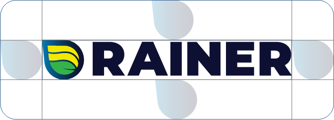
Clear space
Please leave plenty of space around the logos so they stand out. The examples below show the minimum amount of space required. The size of the clear space area around the logo is equal to the width of the Droplet taken from the Rainer Logo.
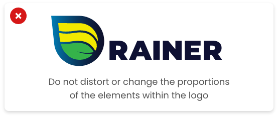
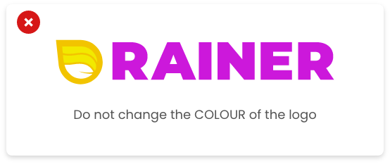
Incorrect use of Rainer logo
The Rainer logo should be the only logo used in all brand communications including internal, external and online. It must not be modified, re-proportioned, redrawn or recolored in any way.
Typography
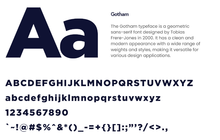
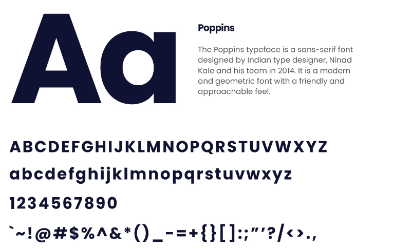
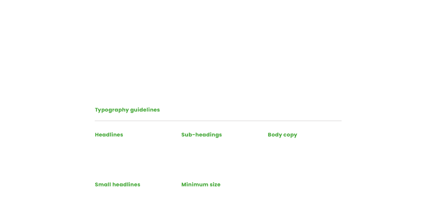
Typography is so much more than just choosing beautiful fonts: it’s a vital component of user interface design. Good typography will establish a strong visual hierarchy, provide a graphic balance to the website, and set the product’s overall tone.
Rainer’s primary typeface
Rainer’s secondary typeface
Font access
If you require access to Gotham or Poppins you may use one of the
following links for licensing:
- Poppins
- Gotham
You can also contact the creative team at admin@artikelandswint.co.nz
Brand Palette
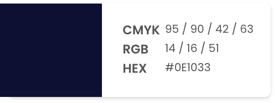
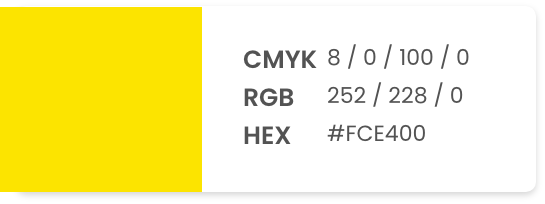
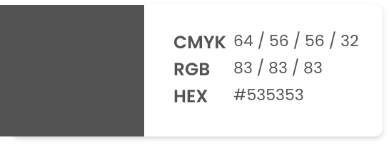
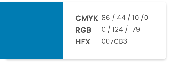
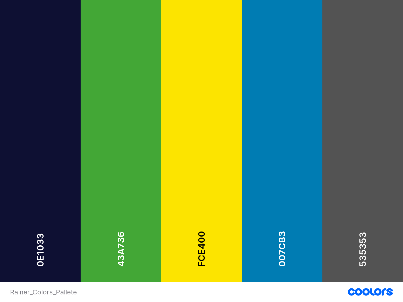
Colour can be used to influence how people think and behave toward a brand, and how they interpret any information. Choosing the right colours for your brand can be the difference between you standing out from the crowd, or blending into it.
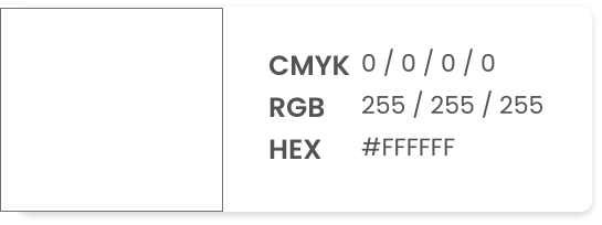
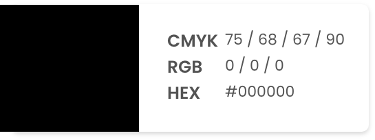
Primary colour palette
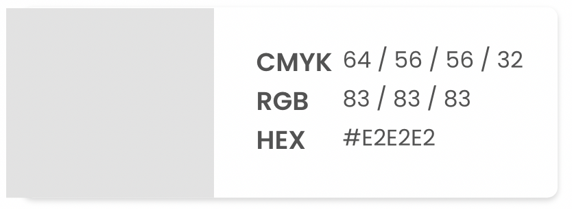
Secondary colour palette
Rainer Gradient
The Rainer gradient was created by blending the dark navy from the primary palette with the light blue from the secondary palette this gradient can be found in the primary logo. The gradient may be used across print and digital applications so long as it is done mindfully.
Imagery
Imagery plays an important role in the Rainer visual presence. Images help to express the brands messages and should reinforce Rainers positioning, values and culture.
Style Guide
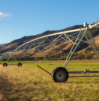
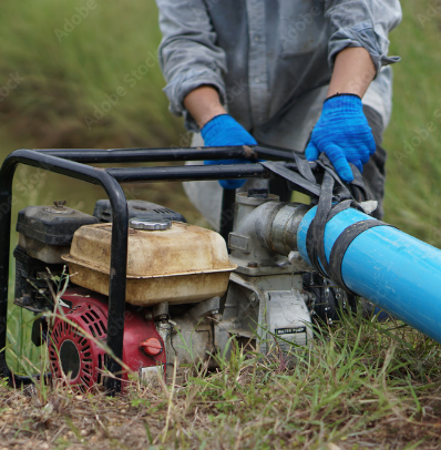
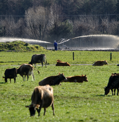
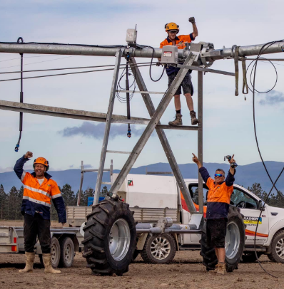
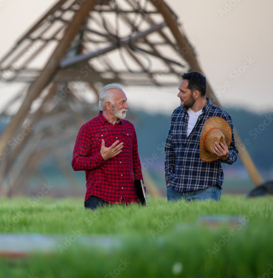
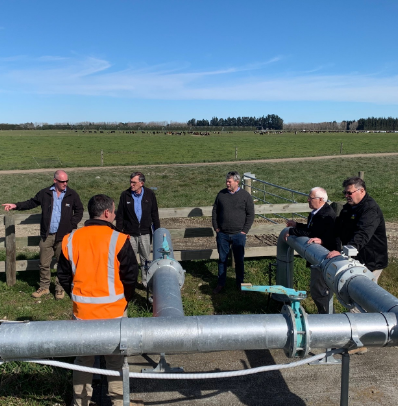
Rainers photography should be representative of its location; wide angle shots of irrigators in green fields with the Alps in the background, High country farms with effluent ponds surrounded by Dairy cows the imagery should include members of the Rainer irrigation team being hands on and involved with their services.
- Focus on Agriculture: Agriculture is the core of the company’s operations, so all photography should showcase the company’s expertise in this field. The images should feature farms, fields, crops, and other elements that highlight the company’s work in agriculture.
- Use Vibrant Colors: The company’s brand should be associated with bright, lively colors. Use rich greens, blues, and earthy tones to convey the company’s connection to nature and agriculture.
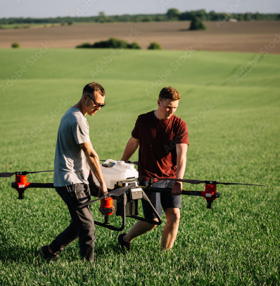
- Show Innovation: The company wants to communicate that they are forward thinking, so the photography should highlight innovation in their work. Feature images of cutting-edge irrigation systems, new technology, and sustainable agriculture practices.
- Highlight Professionalism: The company wants to communicate a high level of professionalism, so the photography should be clean, polished, and well-lit. Use a mix of portrait and landscape orientations to showcase different aspects of the company’s work.
- Incorporate People: Showcasing the people behind the company can help to humanize the brand and make it more relatable. Use images of the company’s staff, clients, and partners to convey a sense of community and collaboration.
- Use Natural Light: Natural light can help to create a warm, inviting feel in photography. Whenever possible, use natural light to showcase the company’s work in a natural, authentic way.
- Avoid Clutter: Keep the photography clean and uncluttered, with a focus on the company’s key messages. Avoid using too many props or elements that distract from the core message.
- Consider Seasons: The company’s work is highly seasonal, so photography should reflect the changing seasons. Use images of crops growing in the spring, summer harvests, and the changing colours of fall to convey the company’s connection to the land.
By following these guidelines, the company can create a photography style that is both professional and forward-thinking, while still highlighting its roots in agriculture.
Imagery
The following are examples of imagery that can be used across your brand, please note that the following images are stock images as well as your brand’s current imagery. If you would like to arrange a shoot to match the following examples please contact admin@artikelandswint.co.nz
Services
Innovation
Culture
Iconography
Where photography is not possible or a message needs to be conveyed graphically icons are a great way to personalise your brand. The following are some examples that have been developed to tie into the new Rainer Branding.
UI
Narrative
Illustration
Print application
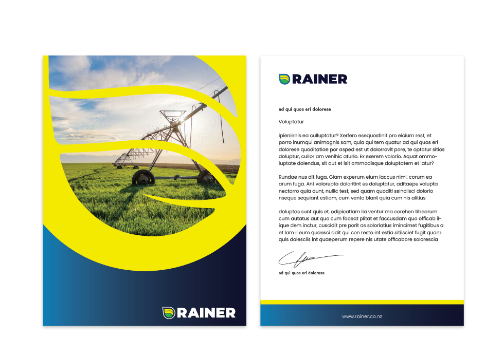
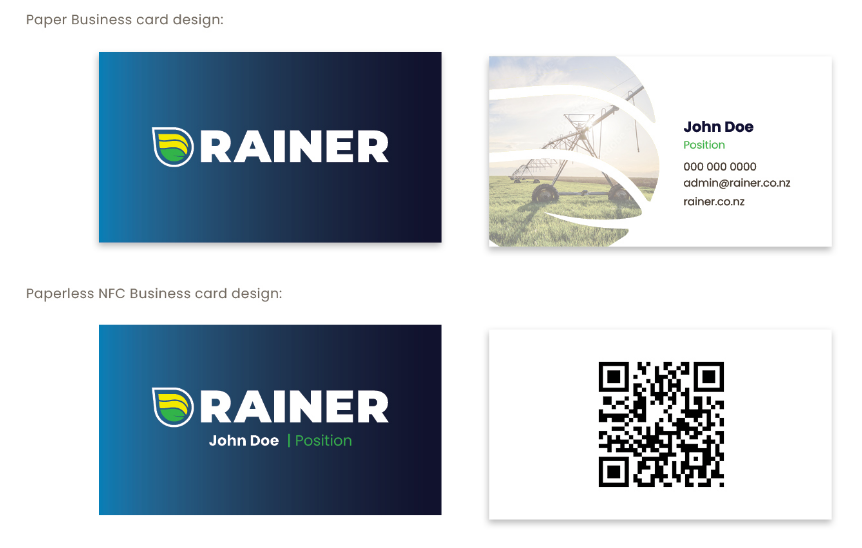
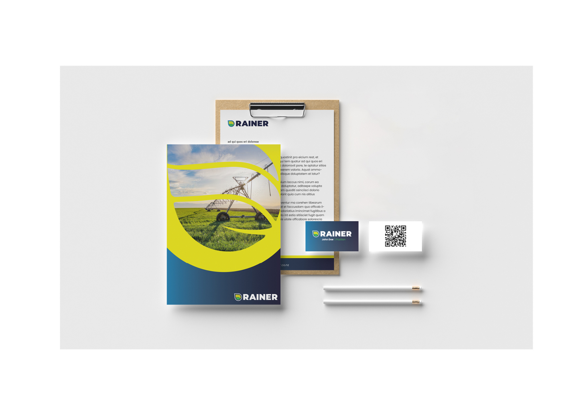
The following examples are how the Rainer brand would be used across print mediums.
Letter head
Business Card
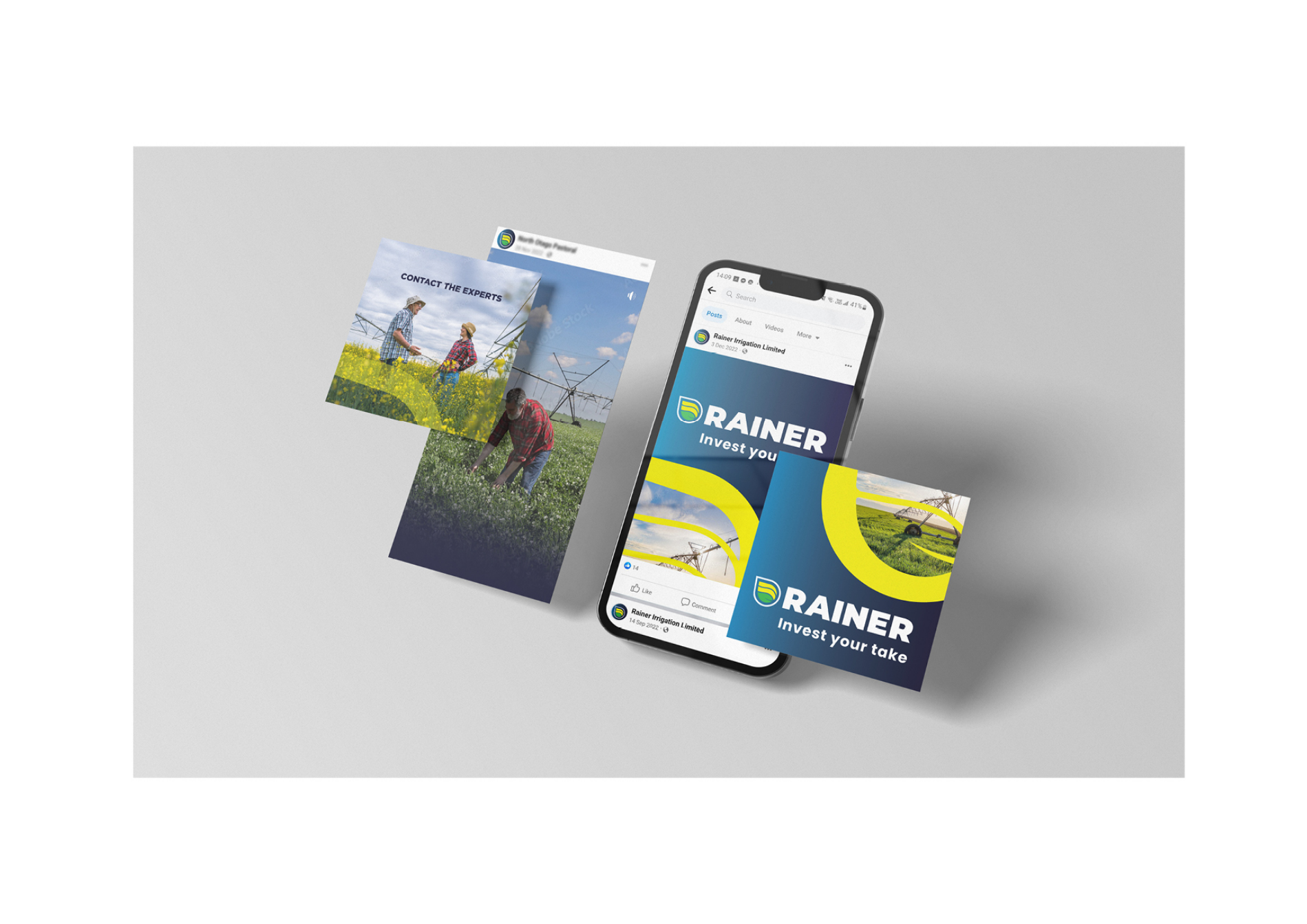
Digital application
The following examples are how the Rainer brand would be used across digital mediums.
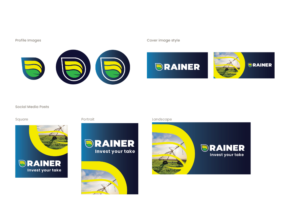
Social media
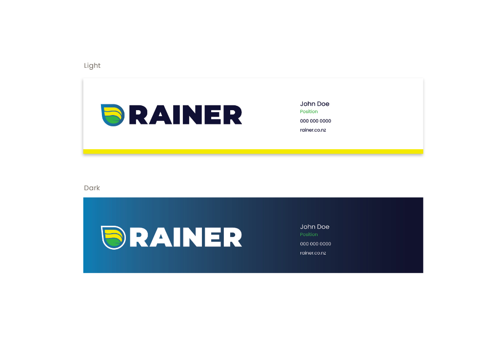
Email signatures